






The New Food Pyramid (2026): What Changed and Should You Still Teach MyPlate? (Scroll below for free 10 page handout pack)
By Judy Doherty, MPS, PCII · CIA-trained chef, former USDA MyPlate National Partner, and the founder behind 30 years of nutrition education materials. Last reviewed September 2026.
The short answer
In early 2026, the USDA replaced MyPlate with a new food pyramid as its official nutrition icon. MyPlate itself remains widely used in classrooms and clinics, and many educators now teach both. The new design is inverted compared with the 1992 pyramid most people remember: the foods it wants you to prioritize sit at the top, and the foods to limit sit at the bottom. Animal proteins and full-fat dairy now occupy the top tier. Whole grains moved to the bottom.
Three numbers changed that matter in practice: protein went from 0.8 to 1.2 grams per kilogram of body weight, full-fat dairy is recommended again, and specific alcohol limits were removed in favor of general guidance to limit intake. Sodium stayed capped at 2,300 mg per day and the added sugar guidance did not change.
Is MyPlate gone?
As the USDA's official icon, yes. The pyramid replaced MyPlate in that role in early 2026. In classrooms and clinics, no. MyPlate is still widely used, and a great many educators now teach both.
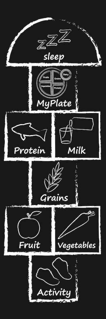
We can see this directly. We sell both lines and both stay busy, with engagement on our MyPlate materials holding right alongside the new pyramid materials. That is not nostalgia. The plate is a portioning tool and the pyramid is a prioritizing tool, and they answer different questions. A plate shows a learner how much of a meal each group should occupy. A pyramid shows which groups to emphasize. Most people teaching real audiences want both answers.
Should you teach the pyramid or MyPlate?
Both, and in that order depending on what you are trying to accomplish.
- Teaching what to eat more or less of — lead with the pyramid. That is the question it is built to answer, and it is the current federal icon, which matters for grant reporting, curriculum alignment and anything audited.
- Teaching how to build a meal — lead with the plate. Nothing beats a round visual for portioning, especially with kids, and in diabetes education the plate method is standard clinical practice that the icon change does not touch.
- Health fairs and mixed audiences — show both. Adults recognize the pyramid shape from childhood and will stop to find out what changed. The plate is what they take home.
If you are building a program from scratch this year, the pyramid is the safer anchor for anything tied to federal guidance. If you already have MyPlate materials that work, they are not dead weight and there is no reason to throw them out.
What the new pyramid looks like
Top to bottom:
- Top tier: animal proteins and full-fat dairy. Meat, eggs, cheese, whole milk.
- Bottom tier: whole grains, alongside the foods the guidelines ask people to limit.
The inversion is the single most confusing thing about the new design, and it is the question you will field most often. Anyone who learned the 1992 pyramid reads "bottom" as "eat the most of this," because that pyramid put bread, cereal, rice and pasta on the base with 6 to 11 servings a day. The 2026 pyramid reverses that convention. Same shape, opposite meaning.
What changed?
They both use the food groups but the shapes changed. The Pyramid wants to show whole foods in groups and it is an inverted triangle while MyPlate is a round plate that shows you where to put the food groups for a balanced diet.
What did not change
Worth saying plainly, because the coverage has focused on the disruption: the guidelines still ask people to favor minimally processed foods, still cap sodium at 2,300 mg, still limit added sugars, and still endorse whole grains. The fundamentals of what you have been teaching are intact. What changed is the picture on the wall and a handful of numbers.
The criticism, and where to land
The design has been criticized in the trade and general press, most pointedly for the inversion itself. A pyramid is a shape people already know how to read, and reversing its meaning without reversing its geometry asks the public to unlearn something. Designers have called it confusing. I think that criticism is fair.
The practical consequence for educators is that the graphic does not teach itself. The 1992 pyramid and MyPlate both did a fair amount of work on their own, because the visual matched the message. This one needs a person standing next to it to explain how to read it. Plan your lesson accordingly, and lead with the pyramid's direction before you get into any of the food groups.
Get the free printable handout below
A 10-page, print-ready summary of the 2026 pyramid: the tiers, the numbers that changed, and a side-by-side with MyPlate. Made for handing out in a classroom, clinic or health fair. Enter your email, and we will send you the download link.
Teaching materials for the new pyramid
If you are updating a classroom, clinic or program, these are the pieces of the 2026 pyramid line. Everything is designed and produced in our own studio.
- The New Pyramid Poster, 18" x 24" laminated
- New Food Pyramid Poster, 18" x 24" laminated
- The New Pyramid Poster, Eat Real Food edition
- New Food Pyramid Poster in Spanish, Come Comida Real
- New Food Pyramid Handout Tearpad, 50 pages
- Healthy Plate and 2026 Pyramid Handout Tearpad
- The New Pyramid Bookmarks, pack of 50
- The New Pyramid Stickers, pack of 50
- The New Pyramid Banner, 36" x 24"
- The New Pyramid Banner Stand, 24" x 67"
- New Pyramid PowerPoint and Handout, instant download
Teaching both? The Healthy Plate and 2026 Pyramid tearpad puts them on one handout, and our MyPlate materials remain in print and in stock.
Questions people ask
Why is the new pyramid upside down?
The 2026 design puts prioritized foods at the top and foods to limit at the bottom, reversing the convention of the 1992 pyramid. The stated intent is to lead with what to emphasize. In practice it means you have to explain the direction before you explain the content.
Should meat and cheese really be the priority now?
The top tier reflects the increased protein target and the return of full-fat dairy. It is not an instruction to build every meal around steak. Read it as a shift in emphasis rather than a ranking of what should fill the most space on a plate.
How much protein does the new guidance call for?
1.2 grams per kilogram of body weight, up from 0.8. For a 150-pound adult that is roughly 82 grams a day, up from about 55.
Are low-fat diets outdated?
The guidelines now recommend full-fat dairy, which is a meaningful reversal. That is narrower than saying low-fat eating is finished. Sodium and added-sugar guidance did not loosen.
Do whole grains matter less now?
They moved position on the graphic but the guidance still endorses them. The fiber target of 25 to 30 grams a day is still supported, even though the written guidance gives it less prominence.
Can I still teach MyPlate?
Yes, and plenty of educators do. MyPlate is no longer the USDA's official icon, but it remains in heavy use in classrooms, WIC offices and clinics, and we continue to see strong demand for MyPlate materials alongside the new pyramid. The diabetes plate method in particular is standard clinical practice and is unaffected by the icon change.
Do I have to replace my MyPlate materials?
No. If a program is tied to federal guidance you will want current pyramid materials for alignment and reporting, but MyPlate posters and handouts still teach portioning as well as they ever did. Most of the educators we work with are adding the pyramid rather than swapping anything out.